What Colors Are Inappropriate for a Wedding? Wedding Decoration Mistakes to Avoid
 Nov, 20 2025
Wedding Color Compatibility Checker
Check Your Wedding Color
Choosing the right colors for a wedding isn’t just about what looks pretty-it’s about respect, tradition, and reading the room. While modern weddings are more flexible than ever, some colors still carry heavy meanings that can unintentionally offend guests, clash with cultural norms, or steal the spotlight from the bride and groom. If you’re planning a wedding and wondering which hues to avoid, you’re not alone. Many couples make this mistake after they’ve already ordered linens, invitations, or florals-and then realize they’ve crossed an unspoken line.
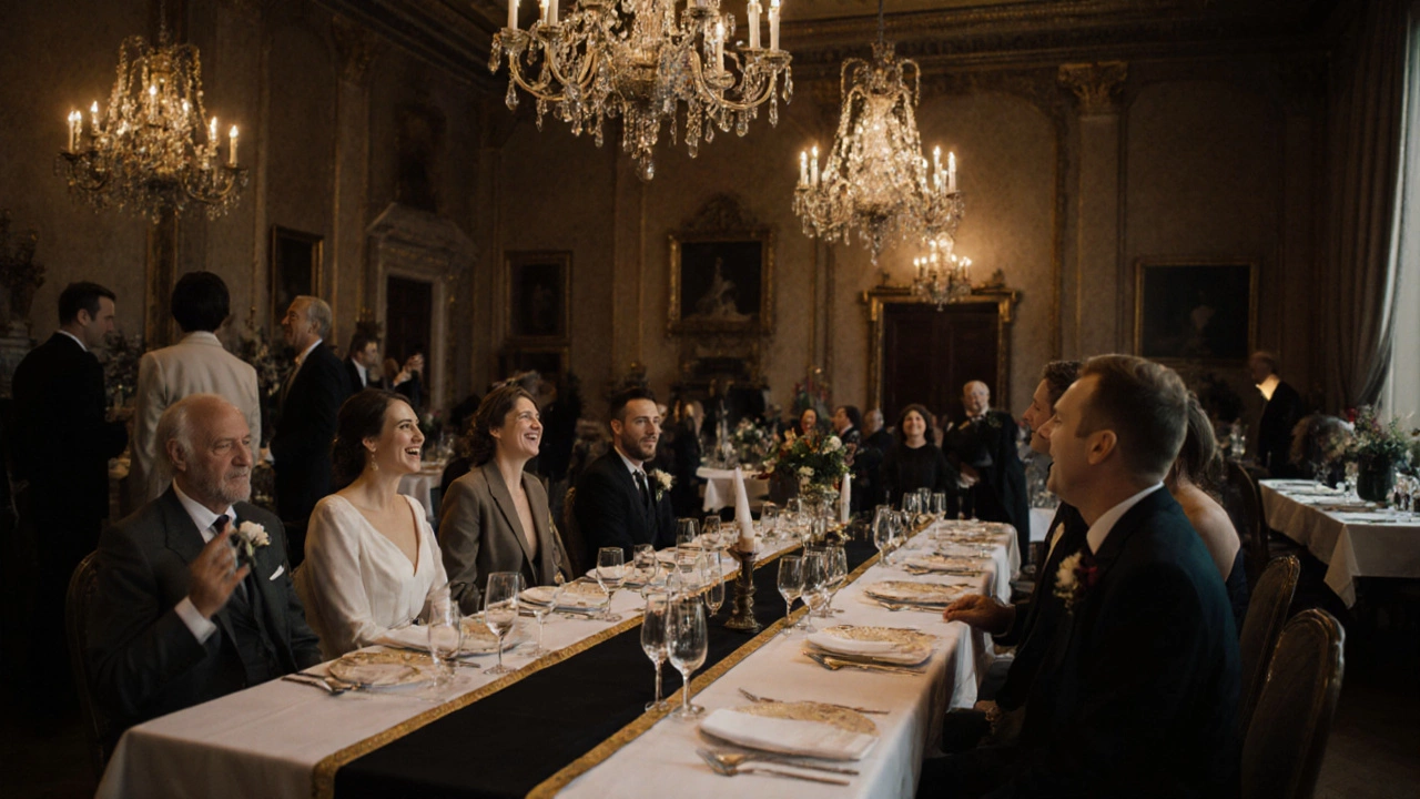
Black Is Not Always a No, But It’s Risky
Black is the most debated color in wedding palettes. In Western cultures, it’s traditionally linked to mourning. While it’s perfectly fine for evening receptions or modern, edgy weddings, wearing or using too much black can send the wrong message. Guests might assume the wedding is a funeral in disguise, especially if the venue is dimly lit or the decor feels somber. A black table runner with silver accents? Fine. A full black bridesmaid dress with black centerpieces? That’s a red flag. If you love black, use it as an accent-not the main theme. One couple in Chicago used black napkins with gold trim and got compliments for their chic contrast. But when another couple painted their entire ceremony arch black, guests started asking if the bride was in mourning. That’s the kind of confusion you want to avoid.
White Is Reserved for the Bride
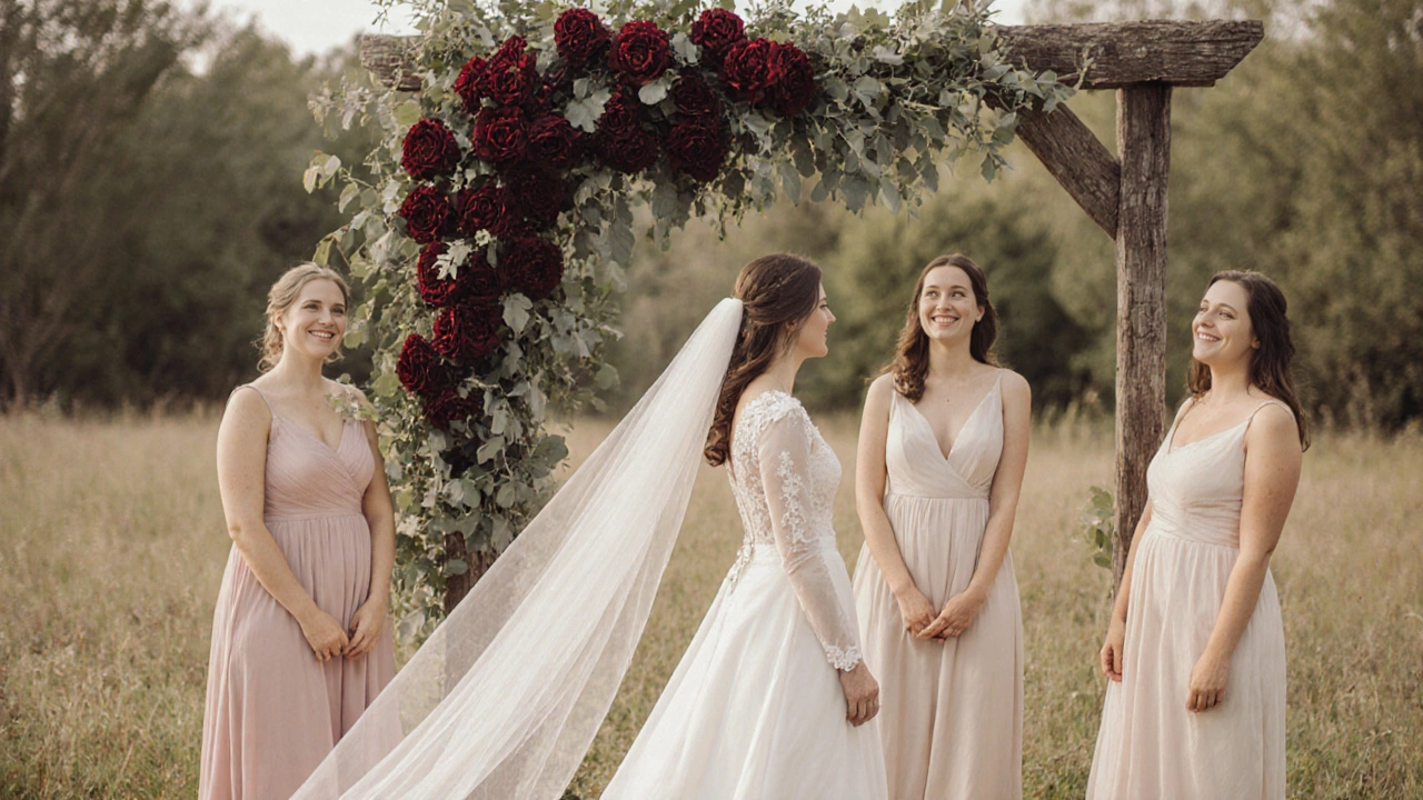
This one seems obvious, but it happens more than you think. White is the bride’s color. Period. That means no white dresses for bridesmaids, no white tablecloths if the bride’s gown is ivory or champagne, and absolutely no white shoes for guests unless they’re plain and subtle. A bride in Florida once noticed three guests wearing off-white dresses and had to quietly ask them to change. She didn’t want to cause a scene, but the visual clash made her feel like an afterthought. Even white accessories-like a white clutch or white floral crown-can look like a copycat. Stick to blush, ivory, champagne, or cream if you’re not the bride. The bride should be the only one glowing in pure white.
Red Can Be a Cultural Minefield
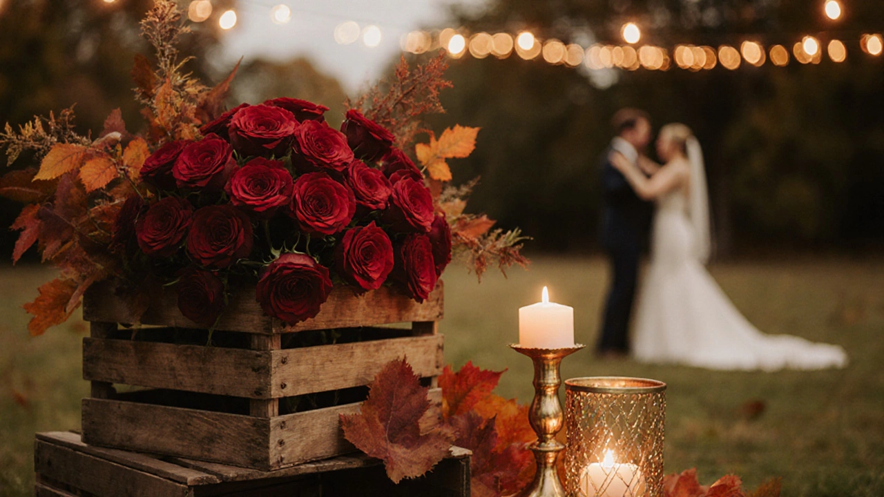
Red is bold, beautiful, and full of energy-but in many cultures, it’s not neutral. In Chinese tradition, red is the color of luck, prosperity, and celebration. But in Western weddings, it’s often associated with passion, anger, or even danger. If you’re hosting a multicultural wedding, red can confuse guests. One couple in Toronto had a red velvet cake and red table runners for their wedding. Their Indian guests loved it. Their American guests thought it looked like a Halloween party. Red can also unintentionally steal attention from the bride, especially if it’s used in large amounts. If you want red, keep it small: a single red rose in each bouquet, a red ribbon on the guestbook, or red heels under the dress. Don’t turn your whole venue into a fire engine.
Don’t Use the Same Color as the Bride’s Dress
This is a quiet but common mistake. If the bride is wearing a blush gown, don’t use blush as the main color for your table settings or floral arrangements. Guests won’t know if you’re trying to match or if you just didn’t realize it’s the same shade. Same goes for ivory, champagne, or even pale lavender. If the bride’s dress is a specific tone, choose a complementary color instead. For example, if her dress is soft ivory, go for sage green or dusty rose. If her dress is pure white, use navy, charcoal, or deep burgundy. The goal isn’t to blend in-it’s to enhance without competing. A wedding planner in Atlanta told me she once had to redo 200 centerpieces because the couple used the exact shade of ivory from the bride’s dress. The bride cried. The guests were confused. The planner lost sleep.
Avoid Neon and Fluorescent Colors
Neon green, hot pink, electric blue-these colors scream “party,” not “ceremony.” They’re high-energy, visually overwhelming, and don’t photograph well. Even if your wedding is themed as “fun and wild,” these colors will make your photos look like a rave. One couple in Austin used neon yellow napkins and bright orange flowers. Their wedding photos looked like they were taken under a blacklight. Guests said it felt like a 90s dance club, not a romantic event. These colors also age poorly. Ten years from now, you’ll look back and cringe. Stick to muted tones, earthy shades, or classic jewel tones like emerald, sapphire, or ruby. They’re timeless, elegant, and forgiving in photos.
Gray and Silver Can Feel Cold
Gray and silver are often chosen for their modern, minimalist appeal. But they can also feel lifeless, especially in large quantities. A gray carpet, silver chairs, and gray table runners can make your wedding feel like a corporate event. If you love these colors, pair them with something warm: wood tones, candlelight, or soft gold. One couple in Seattle used silver tableware with rose gold cutlery and amber candles. It felt luxurious, not sterile. But another couple used all gray with no contrast-and guests said it looked like a funeral reception. Color isn’t just about aesthetics-it’s about emotion. You want warmth, not chill.
What About Purple?
Purple has a complicated history. In some cultures, it’s the color of royalty. In others, it’s tied to mourning. In the U.S., purple is often associated with funerals, especially in older generations. One grandmother in Ohio refused to attend her granddaughter’s wedding because the bridesmaids wore lavender. She said, “That’s the color we used at your grandfather’s service.” The bride didn’t know. The family was torn. If you want purple, go for deep plum or eggplant-it reads as rich and sophisticated. Avoid light lavender unless you’re sure your guests won’t connect it to loss. When in doubt, ask older relatives. They might not say anything, but they’ll notice.
How to Pick the Right Palette
Start with the season. Spring? Soft pastels. Fall? Rust, mustard, deep red. Winter? Emerald, navy, gold. Summer? Coral, sky blue, mint. Then think about your venue. A beach wedding? Avoid dark colors-they absorb heat and look out of place. A rustic barn? Earth tones work. A ballroom? Jewel tones shine. Use your dress and the venue as your anchors. Then, pick two main colors and one accent. That’s it. Too many colors look messy. Too few look boring. Three is the sweet spot.
Test your colors in natural light. A swatch that looks perfect in the store might look muddy under your venue’s lighting. Order fabric samples. Hold them next to your dress. Take photos in the actual space. Ask three trusted friends: “Does this feel like a wedding?” If even one says no, reconsider.
When Tradition Meets Personal Style
Weddings are personal. You don’t have to follow every rule. But you do have to respect the space you’re in. If your family comes from a culture where certain colors mean something, honor that. If your venue has a strict color policy (many historic churches and hotels do), follow it. The goal isn’t to be rebellious-it’s to be thoughtful. A wedding isn’t just about the couple. It’s about bringing people together. Colors can either welcome guests or make them feel like outsiders.
One couple in New Orleans broke every rule: they used black, red, and gold. But they did it with intention. They honored Creole heritage, used the colors in meaningful patterns, and explained it all in their program. Guests didn’t just accept it-they celebrated it. The difference? Context. Purpose. Clarity. When you break a rule, make sure it’s because you’re adding meaning, not just being different.
Final Rule: If You’re Unsure, Skip It
There’s no prize for being bold. There’s no award for matching your bridesmaids’ shoes to your dog’s collar. If a color makes you pause-stop. Ask a friend. Look at photos from past weddings. Google it. If you’re still unsure, choose something safer. You’ll thank yourself later. Your wedding day should feel joyful, not awkward. The right colors don’t just look good-they make people feel welcome.
Is it okay to use white for wedding decorations if the bride isn’t wearing white?
Yes, but only if the bride’s dress is a different shade-like ivory, champagne, or blush. Pure white linens, table runners, or centerpieces can still compete visually with the bride’s look, even if she’s not in white. To avoid confusion, use off-white tones instead. If the bride is wearing ivory, choose cream or beige for decor. The goal is harmony, not mimicry.
Can I use red if my wedding is outdoors in the fall?
Absolutely. Red works beautifully in fall weddings when paired with deep greens, burnt orange, or gold. Think maple leaves, pomegranates, or cranberries. The key is balance. Use red in florals, napkins, or accents-not as the dominant color. Avoid neon red or too much of it in one area. A few red roses in a rustic wooden box or a red ribbon on place cards adds warmth without overwhelming.
Why is black considered inappropriate for weddings?
In many Western cultures, black is linked to mourning and funerals. While modern weddings are more relaxed, using black as a main color can still make guests feel uneasy, especially older relatives. It can also make photos look gloomy or uninviting. That said, black as a small accent-like a black lace overlay or black heels-can be elegant. Just avoid black tablecloths, black bouquets, or black bridesmaid dresses unless you’re going for a very intentional, modern aesthetic.
What colors should I avoid for a beach wedding?
Avoid dark, heavy colors like navy, charcoal, or deep purple-they absorb heat and look out of place against sand and ocean. Neon colors also clash with natural tones. Stick to light blues, soft pinks, coral, cream, or sage green. These colors reflect the environment and feel light and airy. If you want contrast, add a touch of gold or terracotta. Keep it breezy and natural.
Is it okay to use the same color as my partner’s suit?
It’s fine if it’s subtle. If his suit is navy, using navy napkins or a navy ribbon is acceptable. But don’t match exactly-like using navy flowers or a navy cake topper. That looks like you’re trying too hard. Instead, pick a complementary shade: teal, gray, or even a muted burgundy. The goal is cohesion, not duplication. Let each element breathe on its own.
If you’re still stuck, remember this: weddings aren’t about perfection. They’re about presence. Choose colors that make you feel calm, happy, and true to who you are. Then, let the rest unfold. Your guests will remember how you made them feel-not the exact shade of your napkins.