Taboo Wedding Colors: Avoid These Shades for a Perfect Day
Choosing a color palette is one of the first big decisions you make for your wedding, but not every shade works the way you think. Some colors can clash with the venue, hide details in photos, or even make guests feel uncomfortable. Below, we break down the most common color pitfalls and give you easy fixes so your day looks exactly how you imagined.
Common Color Mistakes
Neon and Super‑Bright Hues – Bright pinks, electric blues, and fluorescent greens look great on a party flyer, but under wedding lighting they can become harsh and draw attention away from the couple. They also tend to dominate the décor, leaving little room for personal touches.
All‑Black Themes – Black can be sleek and modern, yet it can feel heavy in a celebration setting. In low‑light venues, black décor can disappear into shadows, making the space look smaller. If you love the drama, pair black with lighter accents like ivory or gold to keep the room lively.
Exact Match to the Season – Picking colors that are too “seasonal” sometimes backfires. For example, deep orange in a winter wedding can clash with frost‑covered surroundings, while pastel yellows in a summer garden may look washed out under bright sun. Think about contrast rather than matching the season exactly.
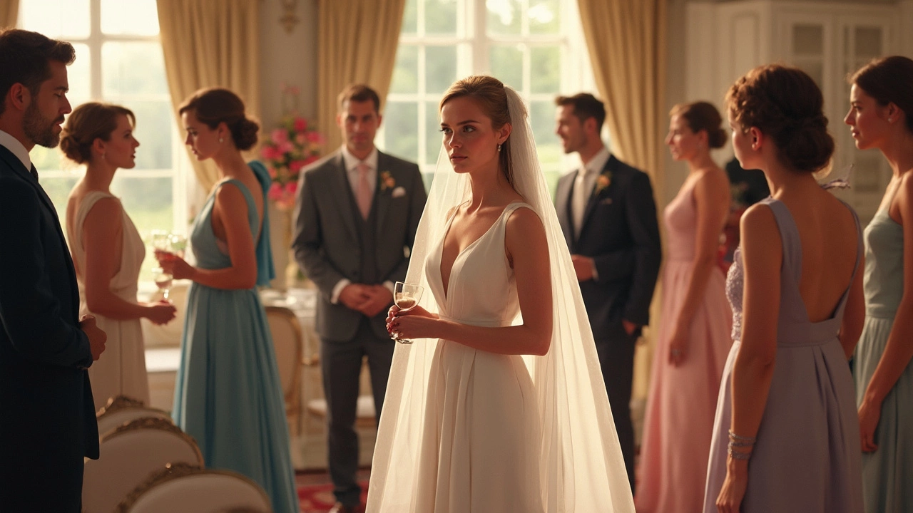
Too Much White with White – An all‑white scheme sounds pure, but it can create a flat look on camera. White on white often hides details like lace or sparkle, especially in daylight. Add a soft, complementary hue—like blush, sage, or light gray—to give depth.
Colors That Don’t Suit the Venue – A beach wedding with dark burgundy drapery will look out of place, just as a rustic barn paired with icy teal can feel mismatched. Always test a small swatch of fabric or décor in the actual location before committing.
Safer Alternatives & How to Choose
Instead of risky neon, reach for muted jewel tones. Sapphire, emerald, or amethyst add richness without overwhelming the space. They also photograph beautifully in both natural and artificial light.
If you love dark palettes, try charcoal or navy paired with metallic accents. A navy gown with gold runners, for instance, gives a sophisticated vibe while keeping the room bright.
For seasonal inspiration, look at natural elements. Autumn weddings can thrive on deep rust, olive, and muted mustard, while spring celebrations shine with soft mauve, dusty rose, and sage.
When you’re drawn to white, layer it. Mix ivory, cream, and a hint of pearl or silver. This layered approach creates texture that shows up in photos and adds subtle interest.
Finally, always bring a color sample to the venue. Hold the fabric in the space at the time of day you’ll be there. If it looks right in the room’s light, you’ve likely found a safe bet.
Remember, the best palette makes your venue, dress, and details complement each other rather than compete. By steering clear of the taboo shades listed above and opting for richer, balanced tones, you’ll create a backdrop that highlights the real star of the day—your love story.