Color Accuracy Tips for Your Wedding Look and Details
When you pick a color for your wedding, you probably imagine it staying the same from the invite to the last dance. In reality, colors can shift between paper, fabric, flowers and even the camera. Getting the hue right means less stress on the big day and a cohesive look that feels exactly how you imagined.
Check Your Materials Before You Commit
Start with the basics: ask for a printed sample of your invitation before you order a batch. Paper stock, ink, and even the printer’s settings affect the final shade. If you love a soft blush on screen, the printed piece might look more orange. Same goes for your bridal gown fabric. Request a swatch from the designer and compare it against the dress you’ll try on in natural light.
Flowers also need a reality check. A picture of a peony in a magazine can look brighter than the real thing. When meeting your florist, bring a color swatch or a printed photo and ask to see the actual blooms. This helps you avoid surprises when the bouquet arrives.
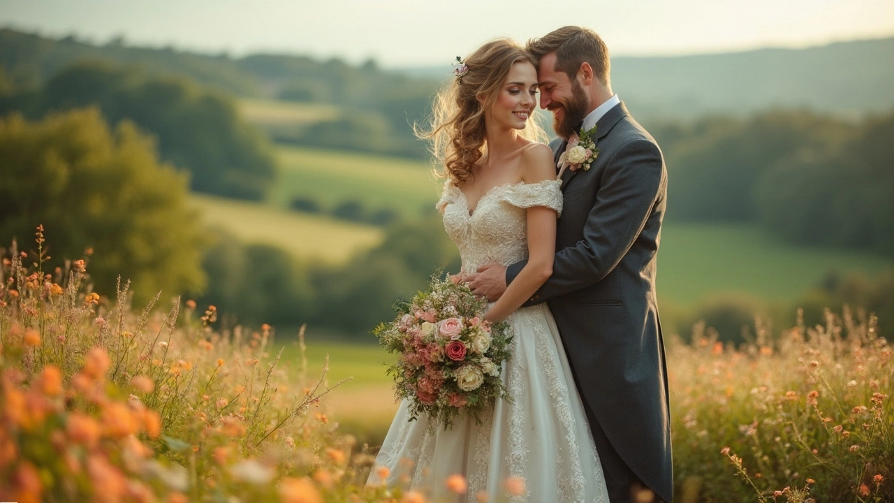
Mind the Lighting and Photography
Even the best‑matched colors can look different under various lights. Warm indoor bulbs make whites look creamy, while daylight can turn pastels into pinks. Walk through your venue at the time of day you’ll be there and note how the light hits the walls and tables. If something looks off, adjust your décor color or choose a different shade of the same hue.
Your photographer plays a big role in preserving color accuracy. Talk to them about the palette you’re using and ask about their camera settings. A good photographer will do a color test shot and let you see the result before the ceremony starts. That way you can tweak lighting or décor if needed.
For a quick fix on the day, keep a small color chart or paint swatch in your planning kit. It’s an easy reference when you’re juggling ribbons, table runners and cake frosting. If a shade looks too bright, a toss of white fabric or a darker accent can tone it down without a full redesign.
Finally, trust your eyes. The internet is full of perfectly edited photos that don’t reflect real life. Stand back, look at everything together, and decide if the combination feels right. If it does, you’ve nailed color accuracy. If not, a small tweak can save you from a mismatched vibe.
Keeping colors true across all wedding elements doesn’t have to be a headache. A few samples, a lighting walk‑through and a quick chat with your photographer are all you need to make sure every hue stays on point. Your wedding will look exactly how you imagined – no surprise pinks, no off‑tone greens, just the perfect palette you love.