How to Make Your Wedding Look Classy: A Guide to Timeless Elegance
 Aug, 6 2026
Wedding Elegance Calculator
Your Sophistication Report
Configure your design choices and click analyze to see how your wedding plans stack up against timeless elegance principles.
Elegance Score
Calculating...Expert Tip
Start configuring your choices to receive personalized advice.
There is a distinct difference between spending a fortune and looking expensive. One relies on receipts; the other relies on restraint. If you are asking how to make your wedding look classy, you are likely tired of the cluttered, trend-chasing aesthetics that dominate social media feeds. You want an event that feels curated, intentional, and enduring. True elegance isn't about adding more-it's about editing down until only what matters remains.
In Melbourne, where we appreciate clean lines and natural beauty, this approach resonates deeply. Whether you are hosting a small gathering in a historic laneway or a larger reception at a vineyard, the principles of sophistication remain the same. It starts with a cohesive vision and ends with meticulous attention to detail. Here is how you can achieve that high-end, polished look without getting lost in the noise.
The Power of a Restricted Color Palette
The quickest way to signal class is through color control. Amateurs often mix too many hues, creating visual chaos. Professionals stick to a tight spectrum. Choose one dominant color, one secondary accent, and one neutral base. For instance, deep emerald green paired with champagne gold and crisp white creates immediate gravitas. Avoid neon shades or overly saturated primary colors unless they serve a very specific artistic purpose.
Muted Tones are colors like sage, blush, taupe, and charcoal that convey subtlety and refinement. They allow textures to speak louder than pigments.When you limit your palette, every element-from the bridesmaids' dresses to the napkins-feels part of a unified story. This cohesion is what guests subconsciously register as "expensive." It tells them that someone thought carefully about every choice.
Texture Over Pattern
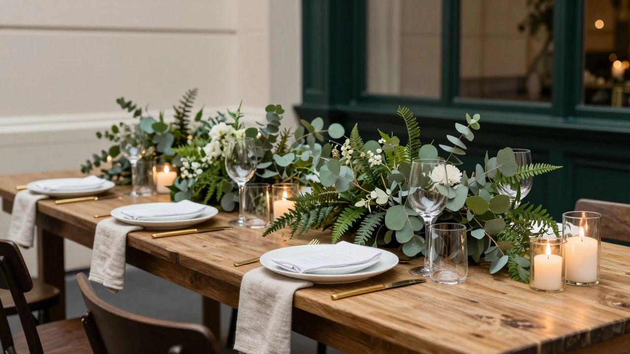
If color sets the mood, texture sets the quality. Flat surfaces feel cheap; layered materials feel rich. Swap out plastic tableware for matte ceramics or heavy glass. Use linen napkins instead of paper ones. The weight of the fabric matters. When a guest picks up a menu card printed on thick cotton paper rather than glossy magazine stock, the tactile experience elevates their perception of the entire event.
- Linen: Opt for unbleached or naturally dyed linens. They wrinkle beautifully and absorb light softly.
- Wood: Reclaimed timber tables add warmth and history. Ensure they are properly sealed to avoid splinters.
- Metallics: Use brushed brass or antique silver rather than shiny chrome. Matte finishes hide fingerprints and look more luxurious.
Think of your tablescape as a landscape. You need height variation, but not through towering centerpieces that block conversation. Instead, use low-profile arrangements with varied foliage shapes-think eucalyptus mixed with ferns-to create depth without obstruction.
Lighting: The Secret Weapon of Atmosphere
You can have the best flowers in the world, but if the lighting is harsh fluorescent overheads, the room will feel like an office. Lighting is the most underrated tool in wedding design. Warm, dimmable lights create intimacy. Harsh, bright lights expose flaws.
Install string lights or Edison bulbs outdoors to soften the edges of the night. Indoors, rely on candles. Real flame flickers in a way that LED never quite replicates. Place taper candles in mercury glass holders or simple pillar candles scattered across the table. The glow reflects off the glassware and cutlery, adding sparkle without needing crystal chandeliers.
Ambient Lighting is indirect illumination that reduces shadows and creates a flattering environment for guests. Aim for a color temperature between 2700K and 3000K for that golden-hour effect indoors.Consider uplighting against walls or trees. It adds dimension to the space and makes flat surfaces disappear into the background, focusing attention on the people and the details.
Floral Design: Less Is More
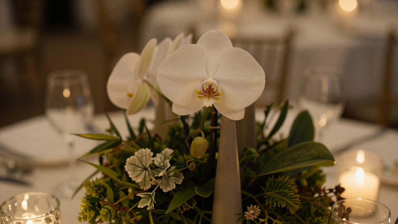
Giant, overflowing bouquets are having a moment, but they can easily tip into tackiness if not handled with care. For a classy look, focus on stem quality and spacing. Leave some negative space in your centerpieces. Let each flower breathe. A single, perfect orchid in a tall vase looks more sophisticated than a dense bucket of mixed blooms.
Choose seasonal flowers. In Australia, spring brings freesias and tulips, while winter offers roses and proteas. Using what is locally available ensures freshness and supports local growers. It also tends to be more cost-effective, allowing you to invest in higher-quality stems rather than quantity.
| Style | Vibe | Best For | Pitfall to Avoid |
|---|---|---|---|
| Minimalist Line Arrangement | Modern, Artistic | Gallery spaces, modern venues | Looking sparse or unfinished |
| Lush Garden Style | Romantic, Natural | Outdoor gardens, barns | Overpowering the scent or blocking views |
| Monochromatic Blooms | Cohesive, Elegant | Any venue, especially formal ones | Using only one type of flower (lack of texture) |
Typography and Stationery
Your invitation sets the tone before guests even arrive. Skip the glitter bombs and laser-cut acrylic. Go for classic serif fonts paired with a clean sans-serif for readability. Cream-colored paper with black ink is timeless. If you want a pop of personality, use a wax seal or a handwritten calligraphy address.
Consistency is key. The font on your invitation should match the signage at the venue, the menu cards, and the thank-you notes. This creates a brand-like consistency that feels professional and thoughtful. Don't switch fonts every time you print something new. Pick two or three maximum and stick to them.
Table Settings and Place Cards
Every guest deserves to feel special. Handwritten place cards are a small effort that yields high returns. Use a calligrapher or practice your own script. Place them on top of folded linen napkins or tucked into a small bud vase.
Avoid plastic chargers under plates. If you want to define the plate area, use a simple cloth napkin or a minimalist ceramic charger. Keep the table clear of unnecessary items. No candy dishes, no excessive condiments visible. Serve bread in baskets, not in individual bowls that take up space. The goal is to give guests room to talk and move their arms comfortably.
Attire and Grooming Details
Class extends beyond decor. Your attire should fit impeccably. Off-the-rack rarely achieves this. Tailoring is non-negotiable. A suit that fits your shoulders perfectly commands respect. A dress that skims your body without pulling or gaping exudes confidence.
Accessories should be minimal. A statement ring is fine; five stacked bracelets are not. Shoes should be comfortable enough to dance in because nothing ruins a classy vibe faster than a bride hopping around in pain. Grooming should be fresh and natural. Heavy makeup can look dated in photos; dewy skin looks timeless.
Music and Entertainment
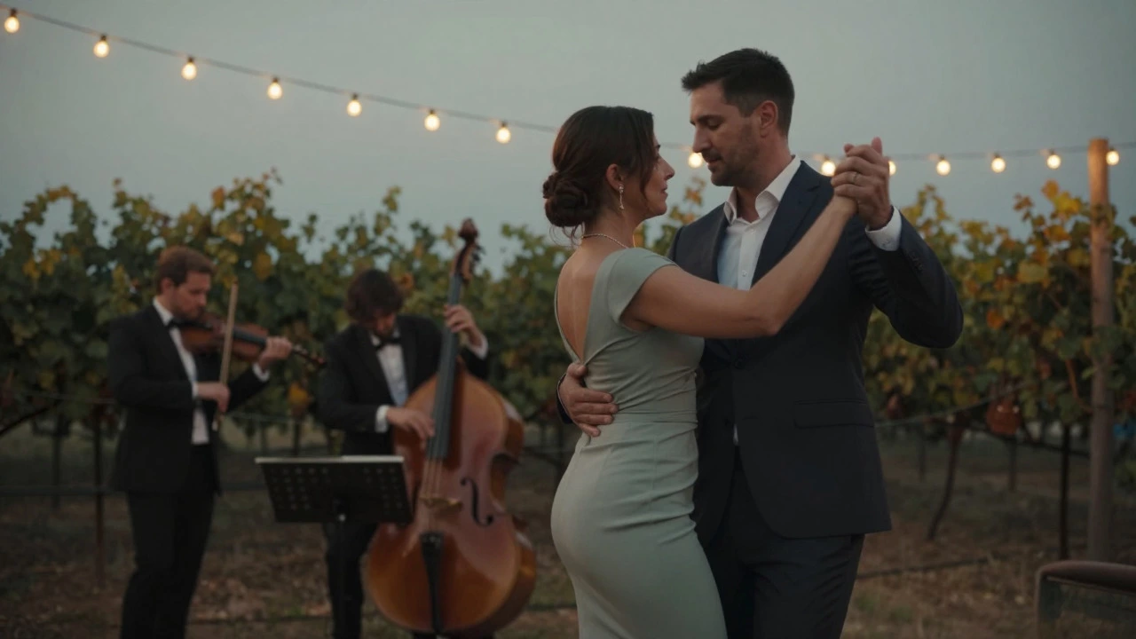
Music dictates energy. A DJ who plays the latest TikTok hits might get people dancing, but it won't feel classy. Hire a jazz trio for cocktails, a string quartet for dinner, and a skilled DJ who knows how to read the room for the late-night set. Acoustic instruments add a layer of sophistication that recorded tracks cannot match.
Volume control is crucial. Guests should be able to converse during dinner without shouting. Music should enhance the atmosphere, not dominate it. Create playlists that flow smoothly, avoiding abrupt genre changes that jolt the mood.
Common Pitfalls to Avoid
To maintain a classy aesthetic, you must actively avoid certain trends that age poorly. First, steer clear of excessive props. Photo booths with silly hats are fun, but they can detract from the elegance if overdone. Second, avoid DIY disasters. If you can't do it perfectly, hire a pro. Crooked lettering or uneven floral arrangements scream amateur hour. Third, don't overcrowd the space. Negative space is your friend. It allows the eye to rest and appreciates the details you did include.
Finally, manage the timeline. Rushed events feel chaotic. Build in buffer times for photos, seating, and speeches. A relaxed couple radiates class; a stressed couple radiates anxiety. Your demeanor sets the tone for everyone else.
Budgeting for Elegance
You don't need a six-figure budget to look classy. You need strategic spending. Allocate more money to areas guests interact with directly: food, drink, music, and seating comfort. Spend less on things they barely notice, like elaborate cake tiers if the taste is mediocre, or expensive favors that end up in the trash.
Invest in rentals that look high-end. Many luxury items, like crystal glasses or vintage furniture, can be rented for a fraction of the purchase price. Cleanliness is paramount. Dusty rentals ruin the illusion. Inspect everything before it goes up.
What colors are considered classy for weddings?
Neutral palettes like ivory, cream, beige, and gray are inherently classy. Accent colors such as deep navy, emerald green, burgundy, or muted gold add sophistication without overwhelming the senses. Avoid neon or highly saturated brights unless used sparingly as accents.
How can I make my wedding decorations look expensive on a budget?
Focus on lighting and texture. Candles are inexpensive but create immense warmth and luxury. Rent high-quality linens and glassware instead of buying cheap disposables. Use plenty of greenery, which is often cheaper than flowers, to fill space and add volume. Keep the design simple and uncluttered.
Is it better to have real flowers or silk flowers for a classy look?
Real flowers generally look more authentic and carry a natural scent that enhances the atmosphere. However, high-quality silk flowers can work if arranged expertly. Avoid obvious plastic-looking blooms. If using silk, choose realistic varieties and mix them with real greenery to mask any artificiality.
What type of music sounds classy at a wedding?
Live acoustic music, such as jazz, classical string quartets, or solo piano, exudes class. For dancing, a DJ who specializes in smooth transitions and understands crowd dynamics is essential. Avoid auto-tuned covers or overly loud electronic beats during dinner hours. Curated playlists with instrumental versions of popular songs can also bridge the gap between modern and elegant.
How does lighting affect the perceived class of a wedding?
Lighting transforms spaces. Dim, warm lighting hides imperfections and creates intimacy. Harsh overhead lights reveal flaws and make guests look tired. Use candlelight, string lights, and uplighting to create layers of brightness. The goal is to flatter faces and highlight decorative elements subtly.