Best Wedding Decoration Colors for 2025: Real Trends from Melbourne Brides
 Dec, 1 2025
Wedding Color Compatibility Checker
Choose your wedding details to get personalized color recommendations based on Melbourne's real wedding trends.
Choosing the right color for your wedding decoration isn’t about picking what’s pretty-it’s about picking what works. Too many couples pick white and gold because it’s Instagram-famous, then end up with a space that feels cold, expensive, and totally disconnected from their vibe. The truth? The best wedding decoration color is the one that matches your story, your season, and your space-not a Pinterest board.
What Colors Actually Work in Real Wedding Spaces
Let’s start with what doesn’t work: pure white walls with gold accents in a dimly lit hall. It looks like a hotel lobby, not a celebration. In Melbourne, where autumn light turns golden and winter brings moody skies, couples who use deep greens, warm terracottas, or even navy blues see better results. These colors don’t fight the light-they hug it.
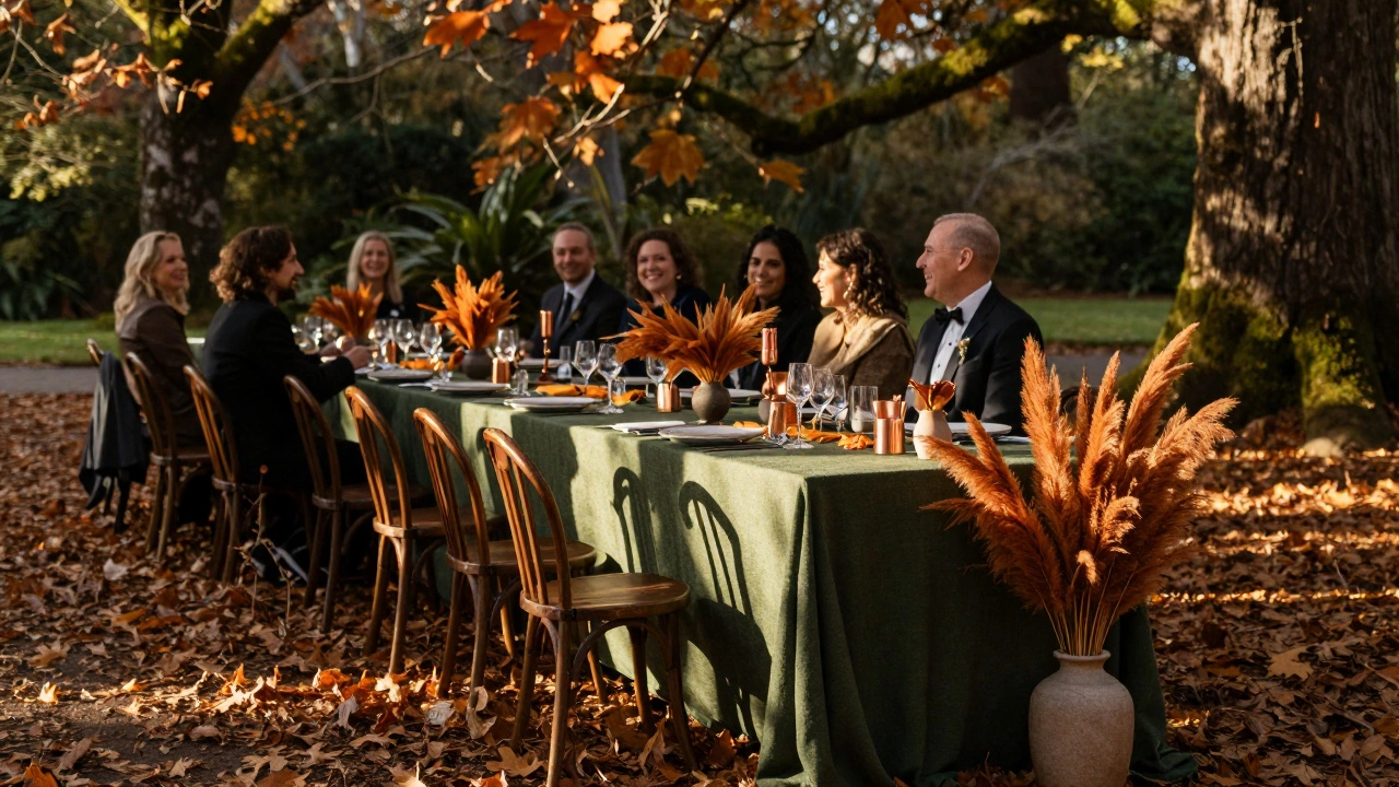
At a recent wedding at the Royal Botanic Gardens, the couple used forest green with burnt orange and copper. The green tied into the trees, the orange echoed the autumn leaves, and the copper reflected the late afternoon sun. Guests didn’t just say it was beautiful-they said it felt like them. That’s the goal.
Color affects mood. Blue calms. Red energizes. Soft pink soothes. Black adds drama. You’re not decorating a room-you’re designing an emotional experience. If your wedding is at 4 p.m. in a barn, you don’t need pastels. You need warmth. If it’s a noon ceremony in a glass-walled venue, you can afford to go bold.
Top 5 Wedding Decoration Colors for 2025 (And Why)
Based on bookings from Melbourne florists, venue stylists, and wedding planners this year, these five colors are dominating real weddings-not just trends.
- Deep Forest Green - It’s rich, natural, and works in any season. Paired with cream linen or brass, it feels luxurious without being flashy. It’s also the most forgiving color for lighting issues.
- Warm Terracotta - Think clay pots, dried pampas grass, and handmade ceramics. This color brings earthy warmth. It’s especially popular for outdoor weddings in late spring and autumn.
- Soft Navy - Replacing traditional navy blue, this is a muted, almost grayish navy. It’s elegant, timeless, and pairs beautifully with gold, blush, or even white. It doesn’t scream "wedding"-it whispers sophistication.
- Blush with Taupe - Not the pastel pink you see everywhere. This is a dusty rose mixed with beige. It’s neutral enough to feel modern, but warm enough to feel human. Works great in minimalist venues.
- Charcoal Gray - Once considered too dark, it’s now a go-to for modern couples. It grounds bright accents, makes floral arrangements pop, and looks incredible under string lights. It’s the new black.
What Colors to Avoid (Even If They’re Popular)
Some colors look amazing in magazines and terrible in real life.
- Neon Pink - It doesn’t photograph well. It overwhelms skin tones. And unless your wedding is a rave, it’s not romantic.
- Ultra-Bright White - Pure white backgrounds reflect too much light. In photos, your guests look washed out. Off-white, ivory, or cream are softer and more flattering.
- Hot Pink and Lime Green Together - This combo screams "children’s birthday party," not "wedding." Even if it’s trending on TikTok, it rarely reads as elegant.
- Too Many Pastels - Mint, lavender, baby blue, peach-it’s not a rainbow. Three colors max. More than that turns your venue into a candy store.
How to Choose Based on Your Venue and Season
Your location isn’t just a backdrop-it’s a color guide.
If you’re having a winter wedding in Melbourne, lean into deep tones: charcoal, burgundy, forest green. Use candles, velvet, and wood to add warmth. Avoid anything too light-it gets lost in the gray.
For a spring wedding, try terracotta, sage, and cream. The gardens are blooming, so match your palette to what’s naturally outside. Avoid bright yellows-they clash with new leaves.
Summer weddings? Go for cool tones: navy, teal, or even pale gray. These colors don’t heat up visually. Add metallics like brushed brass or matte black for contrast.
Autumn? You’re golden. Rust, mustard, deep red, and olive are all in season. Use dried flowers, wooden signs, and linen to keep it grounded.
How to Combine Colors Without It Looking Messy
You don’t need 10 colors. You need one main color, one supporting color, and one accent.
Example: Main = Forest Green, Supporting = Cream, Accent = Copper.
Use the 60-30-10 rule:
- 60% main color - walls, linens, large decor
- 30% supporting color - table runners, bridesmaid dresses, signage
- 10% accent - candles, napkin rings, jewelry, small floral details
Stick to this and your space will feel intentional, not chaotic. Also, test your colors in natural light. What looks perfect in a store under fluorescent lights can turn muddy or too bright outside.
Real Examples from Melbourne Weddings (2024-2025)
At a vineyard wedding in Yarra Valley, the couple used deep plum, cream, and gold. The plum matched the autumn vines. The cream linen softened the space. Gold candles reflected the setting sun. They didn’t spend extra on flowers-they used dried eucalyptus and pomegranates. The photos looked like paintings.
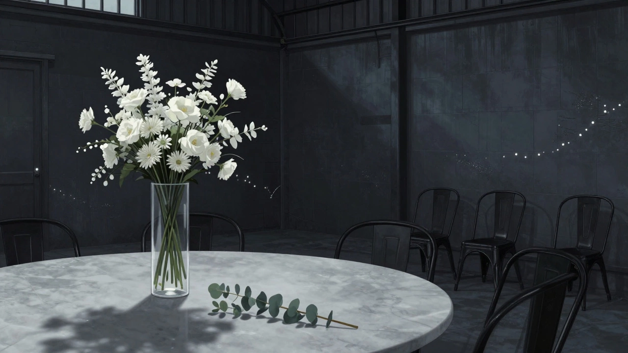
An urban wedding at a converted warehouse in Collingwood went with charcoal gray walls, white floral arrangements, and black metal chairs. No flowers on the tables-just single stems in tall glass vases. Minimalist. Moody. Powerful. It felt like a high-end art gallery, not a party.
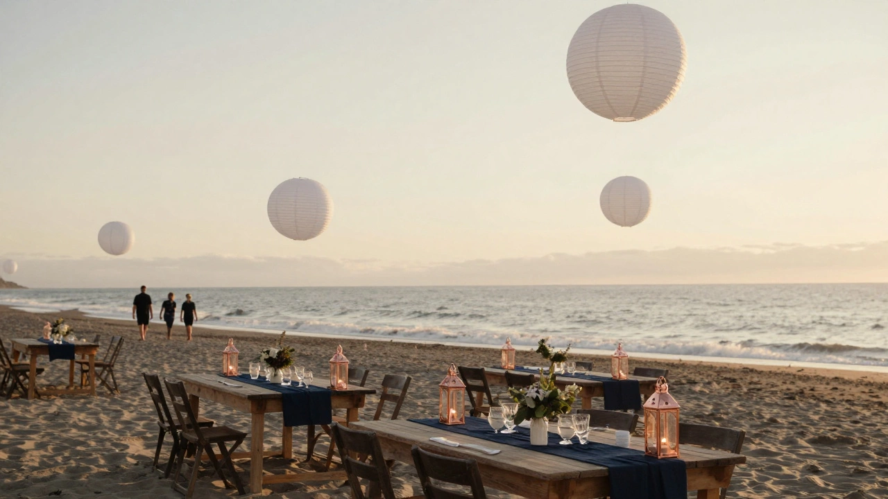
Another couple chose soft navy for their ceremony at St Kilda Beach. They used navy table runners, white lanterns, and copper lantern holders. The ocean was blue. The sky was blue. Their decor didn’t compete-it completed the scene.
Final Tip: Let Your Personal Style Lead
Do you love vintage books? Go for deep burgundy and gold. Are you into mid-century design? Try mustard and olive. Do you hate pink? Don’t force it. Your wedding shouldn’t look like someone else’s dream.
The best wedding decoration color is the one that makes you feel like yourself. Not the most popular color. Not the most Instagrammed color. The one that makes you smile when you walk in.
Start with what you love. Then match it to your season and space. That’s how you get a wedding that doesn’t just look good-it feels right.
What’s the most popular wedding color for 2025?
Deep forest green is the most popular wedding color for 2025, especially in Australia. It works year-round, pairs well with natural settings, and photographs beautifully in both sunlight and candlelight. It’s replacing traditional white and gold because it feels more grounded and personal.
Can I use more than three colors for my wedding decoration?
You can, but it’s risky. Most successful weddings stick to three colors max: one main, one supporting, one accent. More than that creates visual noise. If you want variety, use different shades of the same color family-like navy, midnight blue, and slate-instead of unrelated hues.
Is white still a good wedding color?
Pure white? Not really. It reflects too much light and can make photos look flat or washed out. Off-white, ivory, or cream are better choices-they’re warmer, more forgiving, and still feel elegant. Use white as an accent, not a base.
What colors work best for a beach wedding?
For beach weddings, go with colors that match the sea and sky: soft navy, seafoam green, sandy beige, or warm terracotta. Avoid bright pinks or yellows-they clash with natural tones. Use natural textures like linen, rattan, and driftwood to keep it effortless.
Should I match my wedding colors to my dress?
No. Your dress is your personal statement. Your decor should reflect the overall mood of the event. If your dress is ivory, don’t feel pressured to use ivory everywhere. Let your decor stand on its own. The two should complement, not match.